- For many reasons, it is difficult to impossible to make your plotted output match the colors you see on the screen
- Monitors and scanners are based on an “additive” color system, using the RGB (red, green, blue) color space, while the plotters are based on a “subtractive” system and use CMYK (cyan, magenta, yellow, black)
- Different monitors can vary in many ways, including calibration, variances in the phosphors and bit depths
- Also the range of colors is widely different, with monitors displaying many more colors than any printing device
- BLACK comes in many colors (blue-black, red-black, etc) so test your prints to verify color
- Remember colors will also look different on different types of paper.

Start with these settings in InDesign
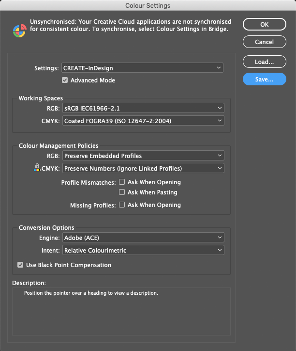
Now: Every bitmap file from here on, that you reference or import into InDesign must be converted to CMYK, and the Coated FOGRA39 ISO profile.
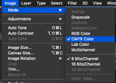
Open the RGB doc. (Typically a jpg/png image)
Next convert it to CMYK by going to: Image -> Mode -> CMYK
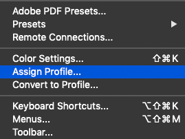
Next assign the FOGRA39 profile.
Edit->Assign Profile
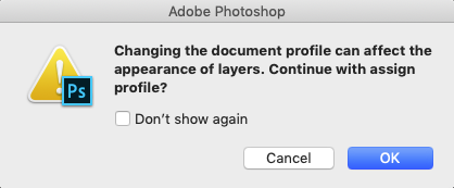
You will most likely get a warning regarding appearance? Click Ok.
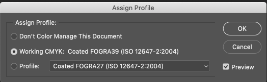
Now select the profile.
You will sometimes have to color adjust/correct your referenced images before plotting, or even just for reports. To learn more about that please look here: https://helpx.adobe.com/photoshop/how-to/adjust-correct-color-balance-photoshop.html
Now save your file as a PSD (photoshop file) and ‘place’ it in InDesign.